Alec Bourgeois: Portfolio
Projects & Clients, 2012–2018
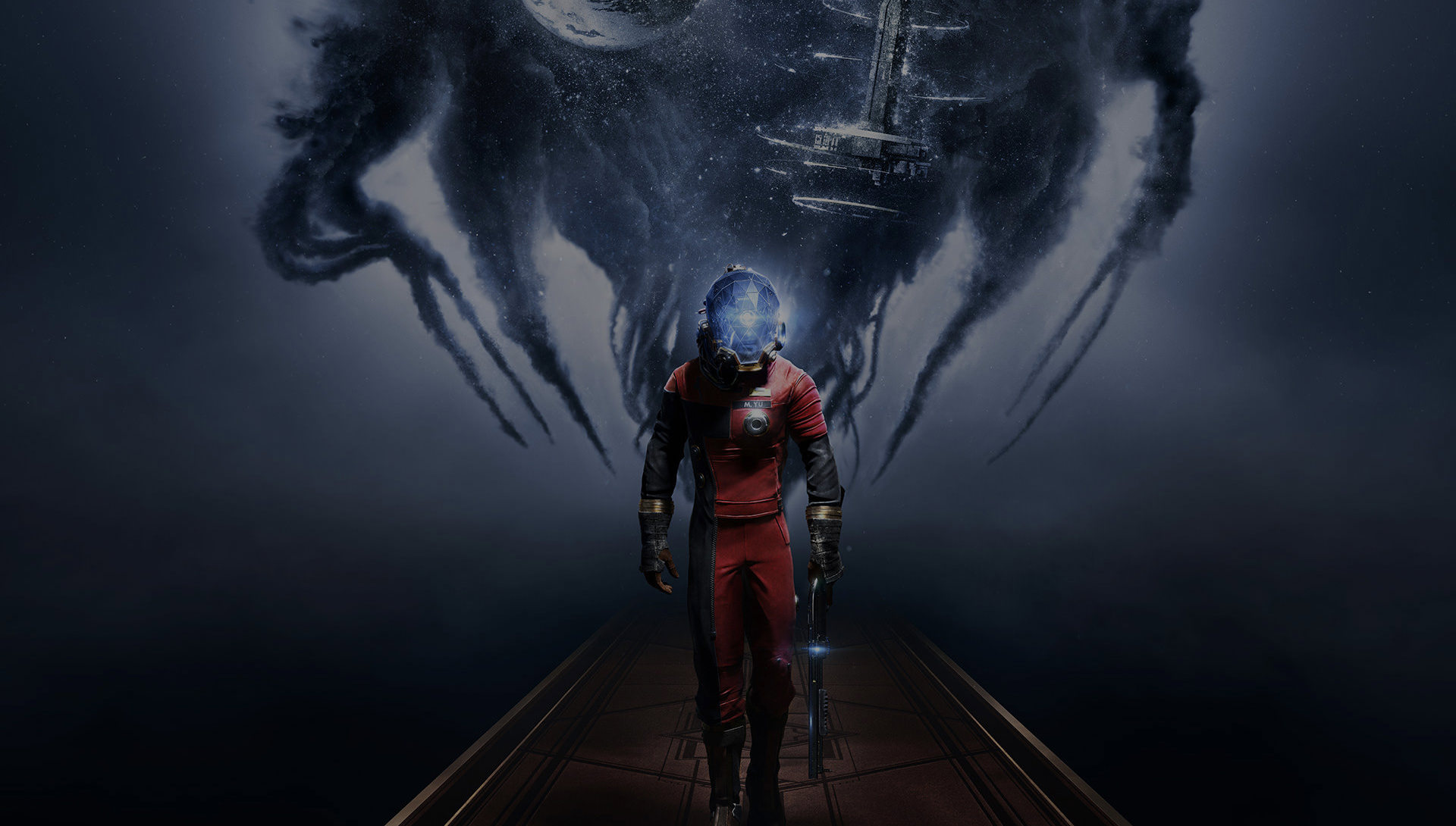
Prey
Client: Bethesda SoftworksProject Lead:
>> Case Study
Bethesda Softworks®, a ZeniMax® Media company, announced the relaunch of the popular Prey franchise at the E3 2016 Conference and LMO was called upon to design and develop a web presence to reignite the fan base and spark interest in the latest installment of the game.


Carnegie Institution for Science, 2015
Client: Carnegie Institution for ScienceProject Lead: Andrew Carnegie founded the Carnegie Institution of Washington in 1902 as an organization for scientific discovery. His intention was for the institution to be home to exceptional individuals—men and women with imagination and extraordinary dedication capable of working at the cutting edge of their fields. Today, Carnegie scientists work in six scientific departments on the West and East Coasts.
nclud was approached to implement a complete redesign of the main website including a robust UX Discovery phase, UX design, Visual Design and Technical Design. The problem was that, like many institutions, Carnegie was used to presenting their very rich content from internal silos outward, instead of thinking about how their their audience constituents would naturally consume it. One of the main business goals to come out of the UX Discovery was the need to have a design structure that would attract more "science enthusiasts", who might more naturally evolve into a supporters, rather than merely the academic audience they had already captured.
Structurally we reorganized the content and navigation to focus squarely around People and Projects, not departments or any other internal silo and effectively separated the "science" from the "institution". Visually we went with lush imagery and implemented clever but targeted interactions to move people through the page and introduce secondary navigation options so different personas with different tasks could easily self identify and move through the site to find the content they need.

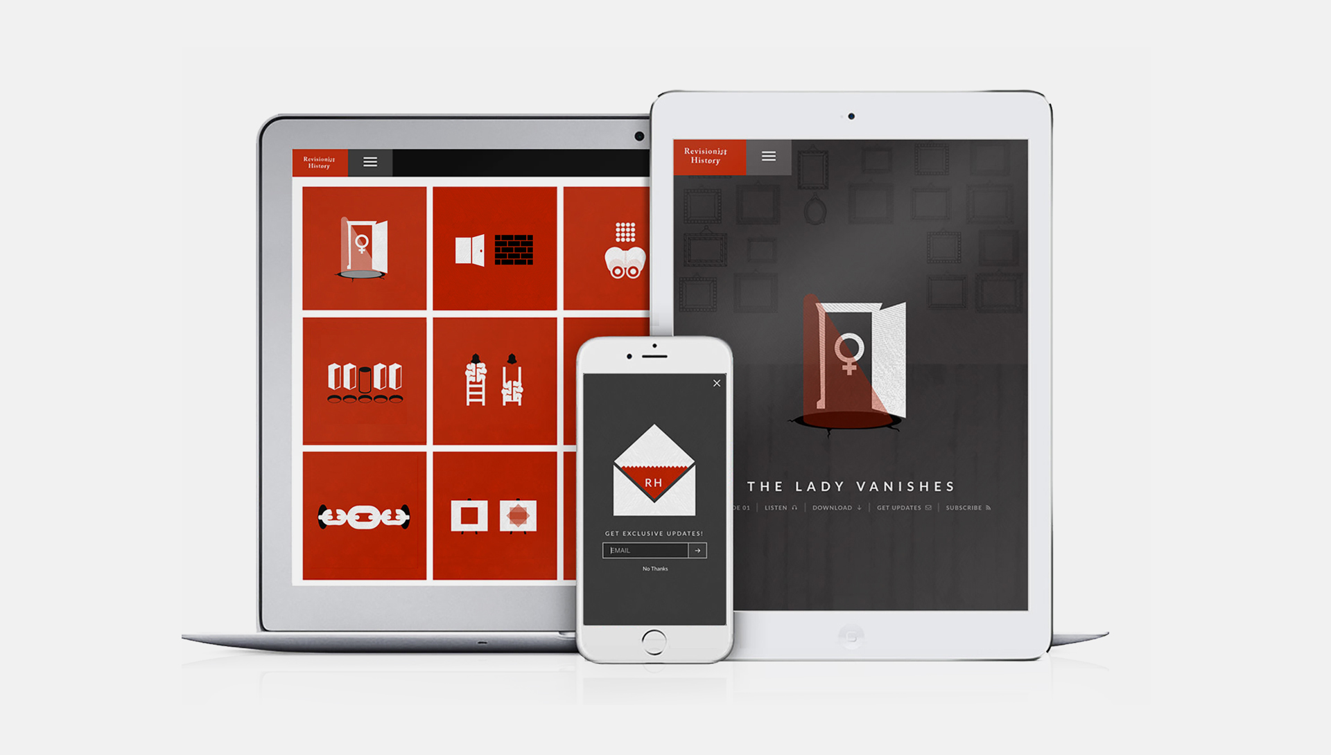
11 Days of Action, 2014
Client: Girl Up - U.N. FoundationProject Lead: The United Nations Foundation’s Girl Up campaign is engaged in a grassroots movement of almost a half a million young activists by featuring the initiative on social media channels and the Girl Up website. To promote and celebrate the United Nations’ International Day of the Girl, Girl Up planned the “11 Days of Action” initiative.
nclud was approached to create an advocacy campaign for the 11 Days initiative that persuaded participants to share personal and emotionally-charged stories with their community and the world. These stories were meant to encourage public and advocacy conversations about challenges young women face globally. And we had just eleven days to do it.
We worked with the United Nations Foundation team to research the content and interactions that the personas of their audiences historically engaged with. By creating a system of three distinct content types — Girls in Action, Girl Up Champion, and a varied call to action, we designed a horizontal experience where each individual day, story, and social conversation was in context with each other — while featuring the theme of the daily campaign topic.
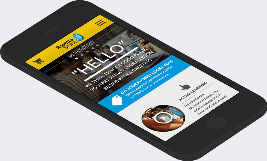
Rosetta Stone (mobile), 2013
Client: Rosetta StoneProject Lead: We used an iterative and idea-driven process — brainstorms, napkin sketches, rough wireframes, paper prototypes — as a way to explore and validate the goals of the content and user experience requirements and the creative brief without getting bogged down too deep in design or building.
The strategy behind Rosetta Stone’s completely redesigned mobile site was to move away from the traditional "yellow box CD-ROM" that the company recently shed with a global rebrand, and instead showcase a future-looking, learn-anywhere software service. Thus, the initial site concept was built around the idea of using mobile interactions and gestures as an engagement feature, not simply as a way to navigate. Incorporating immersive images and videos allows the site to serve rich, interactive storytelling on the go (as well as act as a destination for those looking to purchase the software, of course).
Digital Production/Art Direction, 2005–2012
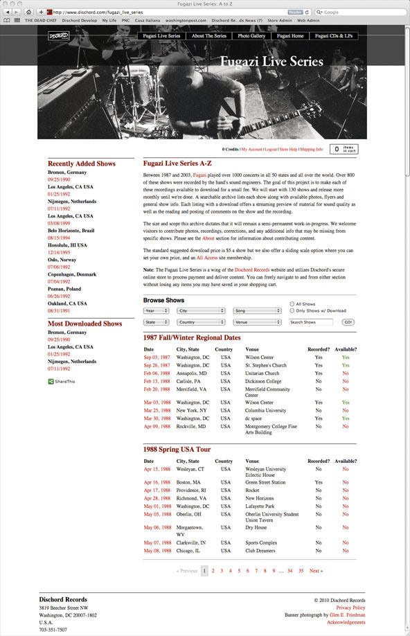
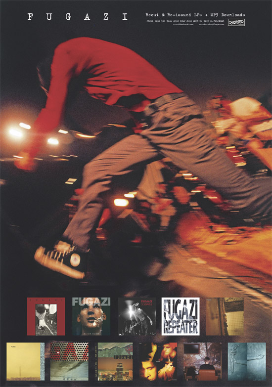
Fugazi Live Series
Client: Dischord Records/FugaziLead Designer & Producer: Designed and managed all aspects of this major archival off-shoot of the Dischord Records website. From 1987 until 2003 Fugazi played over 1000 shows in all 50 states and all over the world. Over 800 of these performances were recorded. Each show is cataloged and presented along with relevant show info, flyers, photos, and a download of each available live performance. The design challenge was two-fold: 1) To present reams of archival information in a simple and intuitive interface that is as deep as it is easy to use. 2) To maintain the basic grid of the parent site while giving the Fugazi Live Site an identity befitting the band's iconic stature. Fugazi has always worked with bold images and deceptively rich but outwardly simple design elements. Bells and whistles have no place here. Ever. A simple font change and expanding the photo elements beyond the parent site's modular borders did the trick. The lead developer is Jerrod Blavos.
Read press features on this project in: The New York Times, The Washington Post, NPR On Air Feature, NPR Blog Piece, Pitchfork Media, BBC Online, SPIN.com, and Wired Magazine.
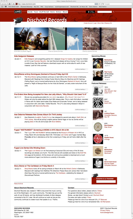
Label Home Site/Store
Client: Dischord RecordsArt Director & Producer: Oversaw a complete overhaul and re-design and of the site including the implementation of a state-of-the-art e-commerce system, a digital music delivery system, a news blog, and a custom CMS capable adding and editing content, controlling the inventory and the functionality of the store, and running sales and royalty reports. The main challenge as Art Director was to manage the diverse visual elements inherent with presenting the work of many artists in a unified and identifiable home environment without compromising individual identity or creating a confusing mess. As Producer I managed the creative and development teams, budgets and server-side delivery. The lead designer was Pau Santesmasses and the lead developer is Jerrod Blavos.
Some Websites from 2008–2010
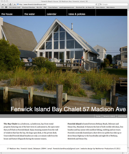
Vacation Rental Property
Client: PrivateDesign & Development: Beach houses are generally utilitarian by nature. However, every so often you find an architect that has clearly taken on utilitarianism as a challenge and produced solutions that are both clever and beautiful. This beach house is a perfect example of what is essentially a kit house that also boasts a lovely mid-century modern design aesthetic. Rather than highlight a laundry list of mundane features that can be found in any rental property I thought the house itself, especially in this setting, was the best marketing device. The design offers a nod to the mid-century elements of the house which in turn helps to unify the page.
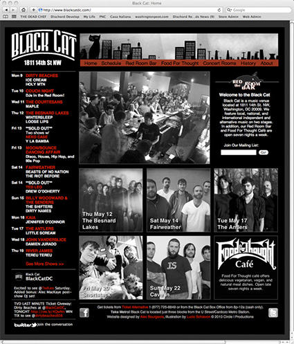
Black Cat Nightclub/Venue
Client: Circle I ProductionsLead Designer & Producer: Redesigning the website for the Black Cat was the final phase of my effort to unify the marketing theme for the club across all formats. I began with a single column layout that could be used individually as a strip or banner ad or joined with a modular elements to present a third, half or full-page layout. Black Cat has a strong neighborhood identity and the client was insistent that the design elements should compliment the true nature of the club. There is a sameness that comes with the web, especially when content needs to be swapped in and out daily. The challenge was to present the content that visitors expect while not bowing down to the boilerplate. The Black and White photos on the home page were the client's idea, and once they were up I had to tip my hat. Some day I'd like to see the site reverse its black and white scheme -- but that will take a better sell job!
Band Website
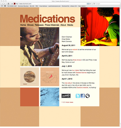
Client: MedicationsDesign & Development: Medications are a fabulous band from Washington, DC. They needed a new home and I needed to an excuse to listen to their music. This one is all about the threes and fours.
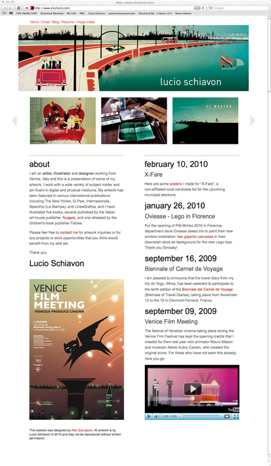
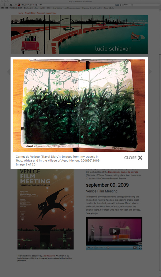
Artist Portfolio/Blog
Client: Lucio SchiavonDesign & Development: Lucio is a very talented artist/illustrator from Venice, Italy. This was a portfolio site I designed for him to showcase his work here in the states.
LP & CD Print/Package Design, 2002–2012
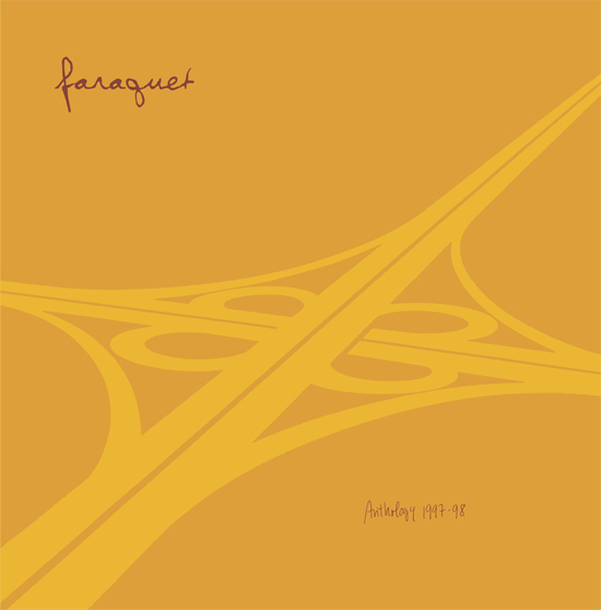
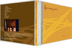
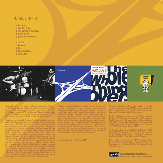
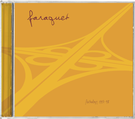
Faraquet, "Anthology" LP & CD package design
Client: Dischord Records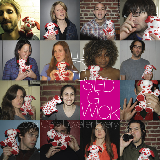
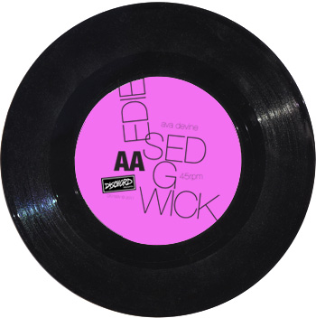
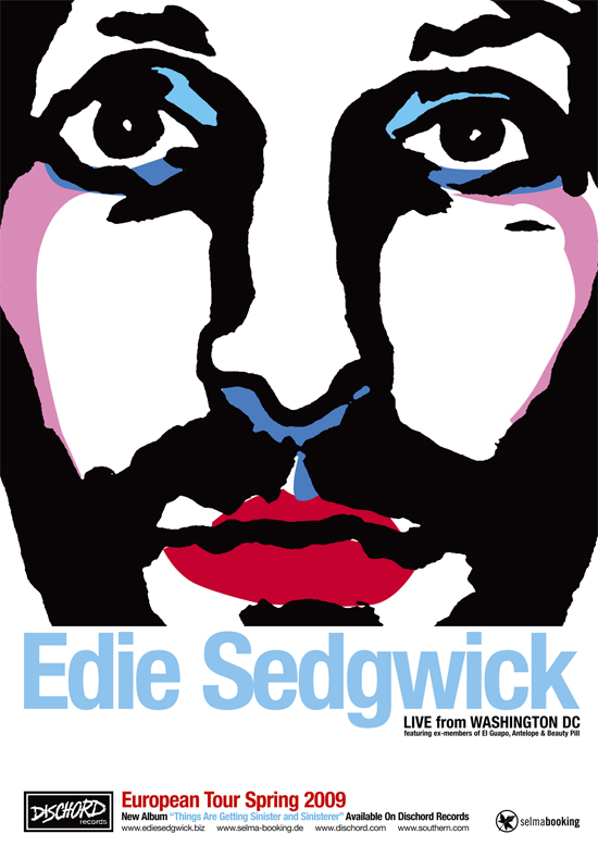
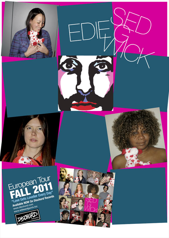
Edie Sedgwick 7 Inch Single package design
Client: Dischord Records
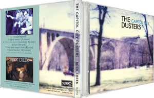
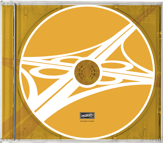
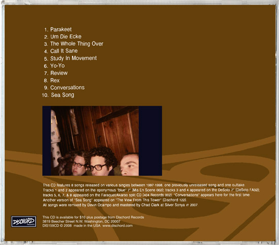
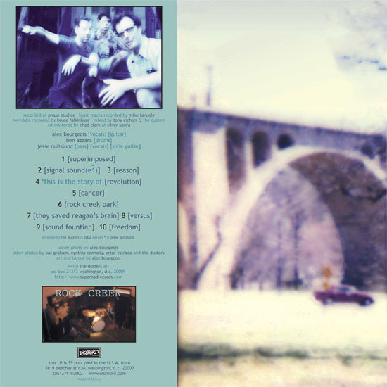
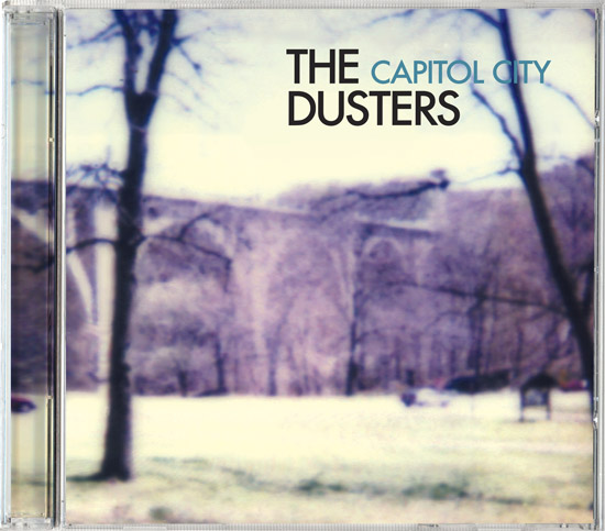
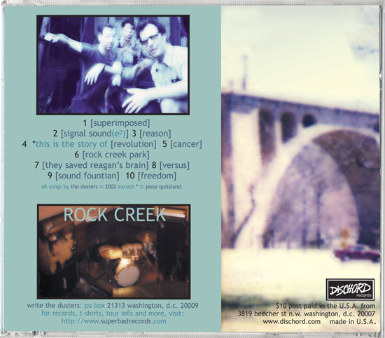
The Capitol City Dusters, "Rock Creek" LP & CD package design
Client: Dischord Records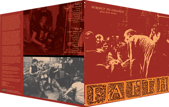
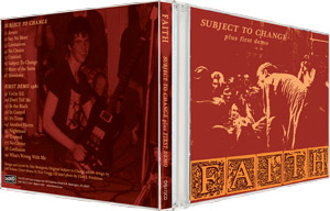
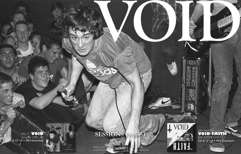
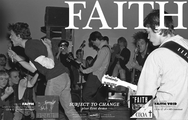
Faith, "Subject to Change" LP & CD package re-design
Client: Dischord RecordsPoster Design, 2002–2012

Alec Bourgeois
Contact via EmailView Resume